Task:
To create a logotype for 'zellow'.
To create a logotype for 'zellow'.
‘zellow’ is an American internet promotion and analytics agency. A company of young and progressive people who are focused on their work and get a kick out of it (and who doesn't get a kick out of a great job?).
Therefore, it was important for the logo to convey all these emotions at the same time - seriousness on the one hand, because here it is about analytics, numbers, money, content, metrics, and on the other hand, ease, when cooperation with the agency goes "on a high", like clockwork and surprisingly efficiently.
Decision:
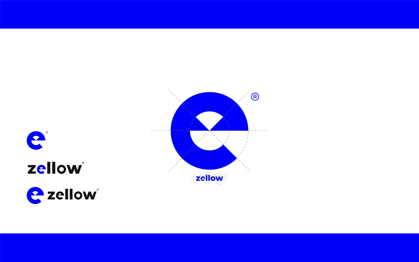
The font mark is built on the basis of the second letter of the name. Thanks to russians, the Latin Z now has negative associations all over the world, so it was undesirable to use it as an independent symbolic element.
The font mark is built on the basis of the second letter of the name. Thanks to russians, the Latin Z now has negative associations all over the world, so it was undesirable to use it as an independent symbolic element.
A clear, geometric sign is successfully combined with a massive font without notches. The form embedded in the modified "e" carries a metaphor of perspective - this is what a path, a road, a path looks like when you look far beyond the horizon. The prospects of cooperation with zellow are a clear positive result that can be calculated and tracked.
The rich blue color is the color of strength and reliability, attracts and helps win the trust of the client. At the same time, bright blue is associated with the latest digital technologies.


Thank you for watching!
Email me on melnikanastasia298@gmail.com or write in Instagram to order a logo.


